 Foundation
 Logo
Logo Colors
 Typography
 Voice & Messaging
 Icons
Icons Applications
 Email Signature
 07 · Icon System
Icon System
28 custom SVG icons built on the brand’s core visual DNA — shield motif, network nodes, rounded line art, and the teal-to-green gradient.
Custom brand-aligned icon set
28 brand-aligned SVG icons replace generic emojis across the entire website and brand. They share a consistent visual language built on the core DNA of the LogicalNet brand.
Design philosophy
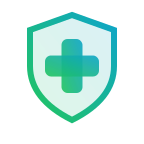
Shield Motif
Used across security-related icons to reinforce trust and protection.
Network Node Pattern
Central hub with outer nodes echoes the “Net” concept in the brand name.
Teal → Green Gradient
Consistent gradient direction matching the shield logomark.
Rounded Line Art
1.5–2px strokes with rounded caps for a clean, modern look.
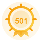
Amber Accent
Reserved for the award/trophy icon only — never used elsewhere.
No Emojis, Ever
Emoji characters are never used as icons. Every icon on the site uses the custom SVG set.
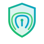
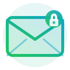
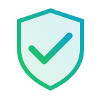
Service card icons
The 6 primary service icons replace the generic emoji previously used on the homepage service cards. Designed at 48×48px with a 1.5px stroke weight, utilizing the brand’s teal-to-green gradient.
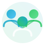
“Why LogicalNet” differentiator icons
Six icons representing the brand’s key differentiators — used throughout the homepage and about sections.
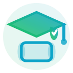
Industry icons
Five icons representing the key industries LogicalNet serves.
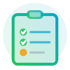
Navigation dropdown icons
The 12 navigation dropdown icons are designed at 32×32px to fit comfortably within the site’s mega-menu. They share the same 1.5px stroke weight and gradient fill as the primary service icons, ensuring visual consistency across all touchpoints.
Resources & Solutions navigation icons
Four navigation icons for the Resources dropdown and free vulnerability scan entry point. Same 1.5px stroke weight and gradient palette as the primary nav set.
Cybersecurity Symposium icons
Four icons supporting the annual Tech Valley Cybersecurity Symposium navigation and event pages — register, sponsor, recap, and past archives.
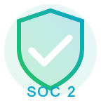
Footer & top bar icons
Accreditation and utility icons used in the site footer and top bar. These sit at small sizes (16–18px) and use a more constrained color palette for legibility at scale.
Icon Usage Rule
The custom SVG icon set is mandatory for all LogicalNet communications. Emoji characters (whether Unicode or HTML entities) should never appear as icons in any web page, document, email, presentation, or other brand touchpoint. The only exception is the hamburger menu character (☰) used in mobile nav toggles.
Questions about brand usage?
Contact the marketing team for brand approvals, source files, or guidance applying the brand in specific situations.