Logo System
The three official logo variants, shield anatomy and meaning, clear space rules, minimum sizes, and usage standards.
Three logo variants
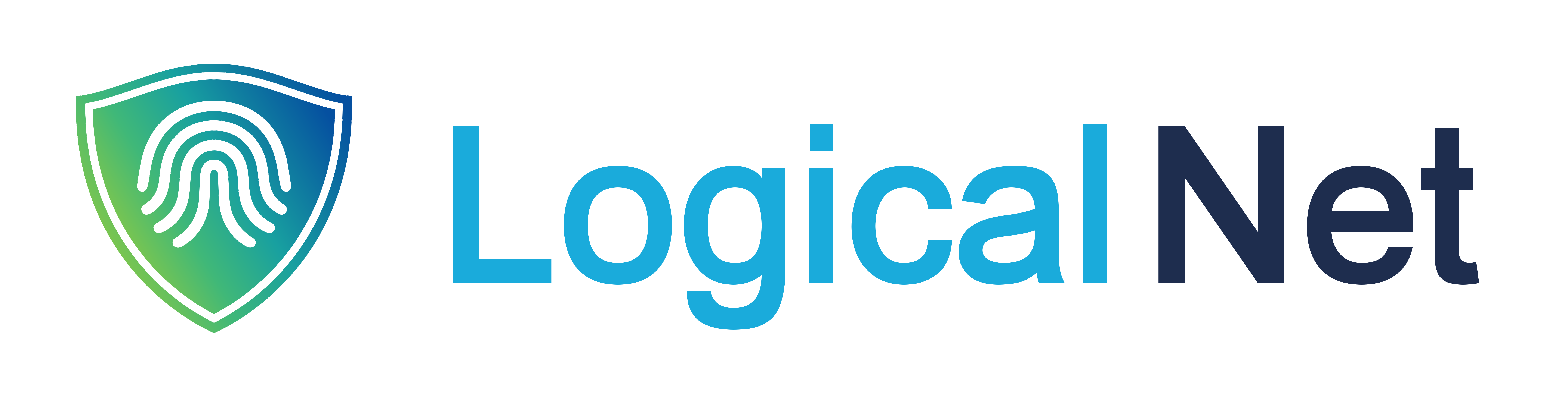
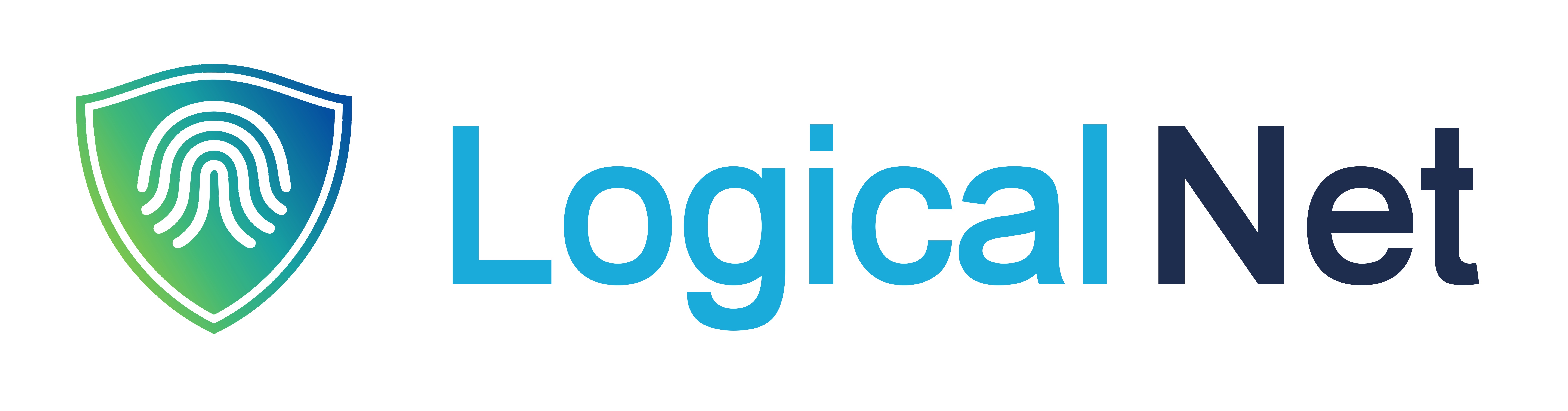
The LogicalNet identity uses three official logo variants. Each has a specific role, and they should never be mixed, modified, or recreated.
1. Full Lockup (Primary)
Shield mark + wordmark, horizontal lockup. Use for primary brand placements like headers and signatures.

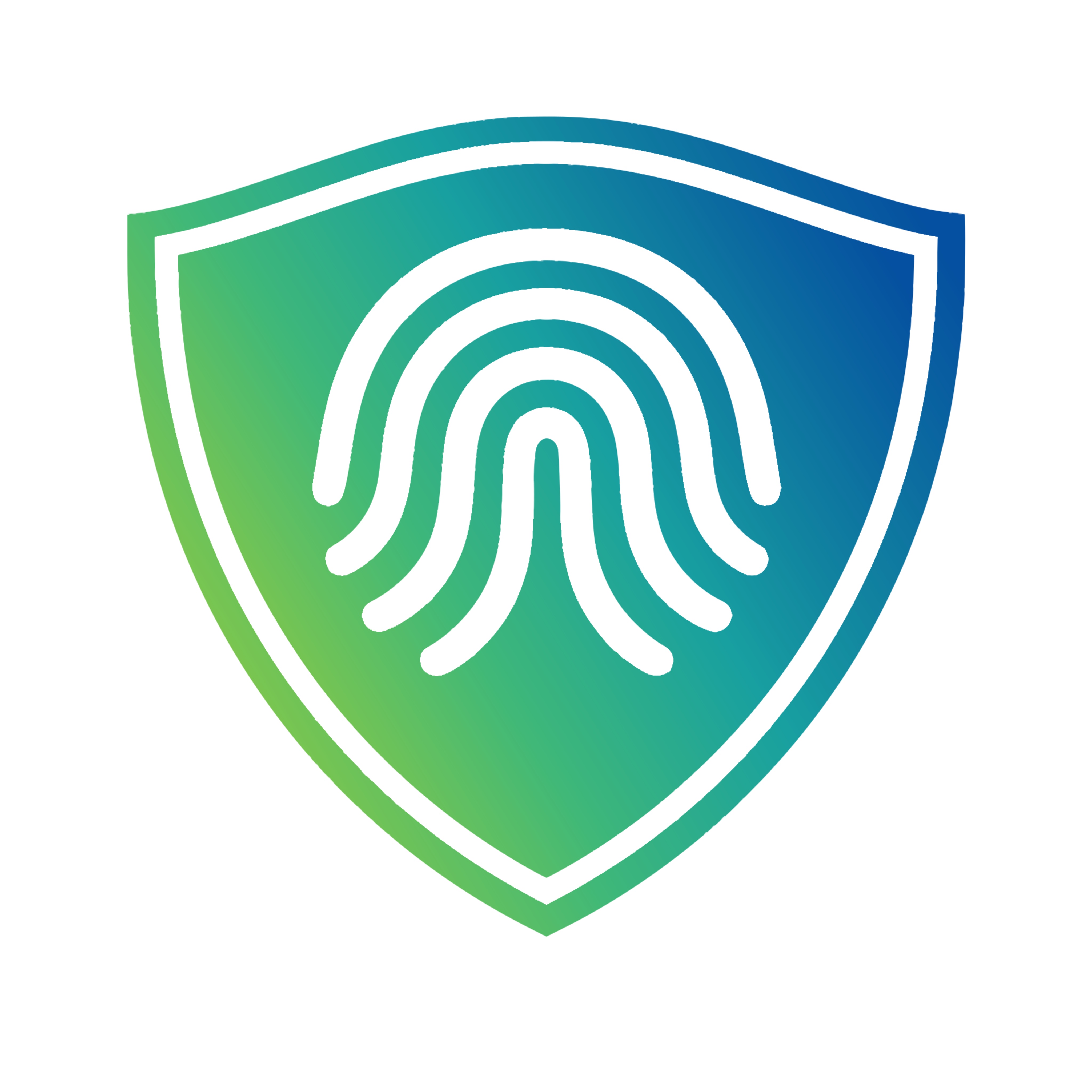
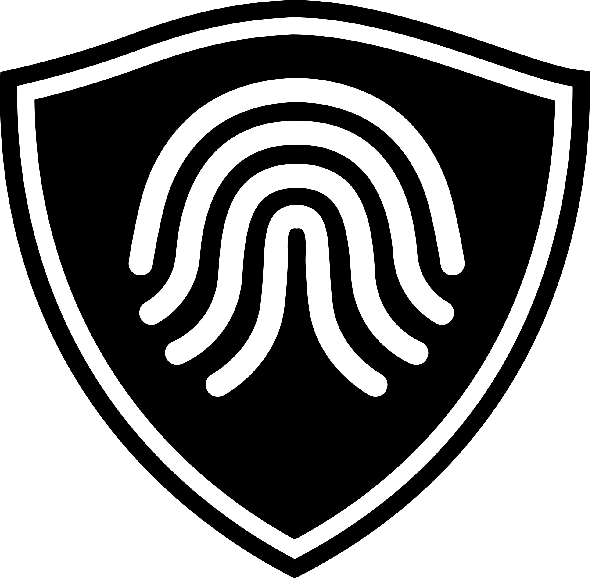
2. Shield Mark Only
Shield with fingerprint only — use for favicons, app icons, social avatars, and tight spaces.

3. Wordmark Only
“LogicalNet” text without the shield. Use when the mark is already present in the composition.
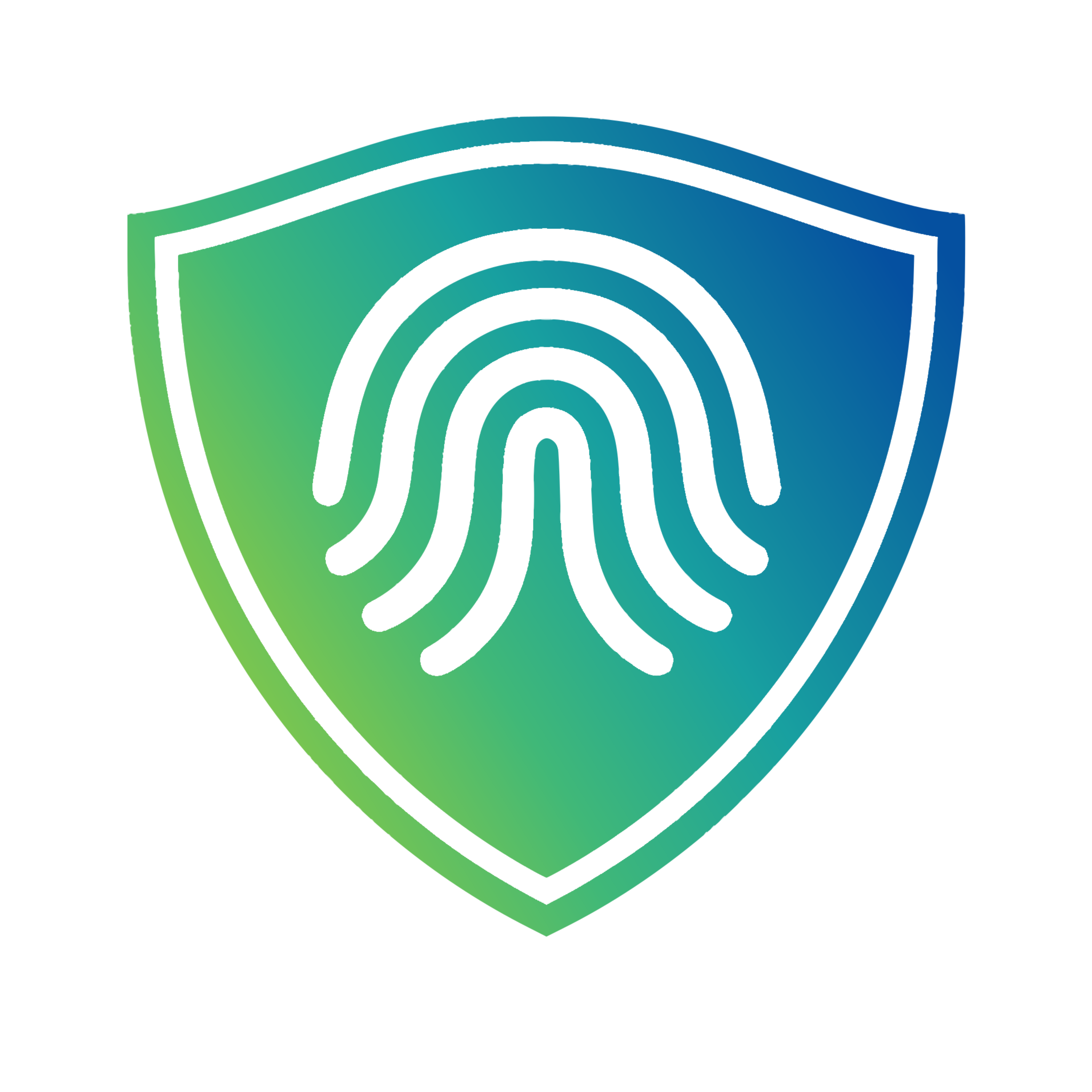
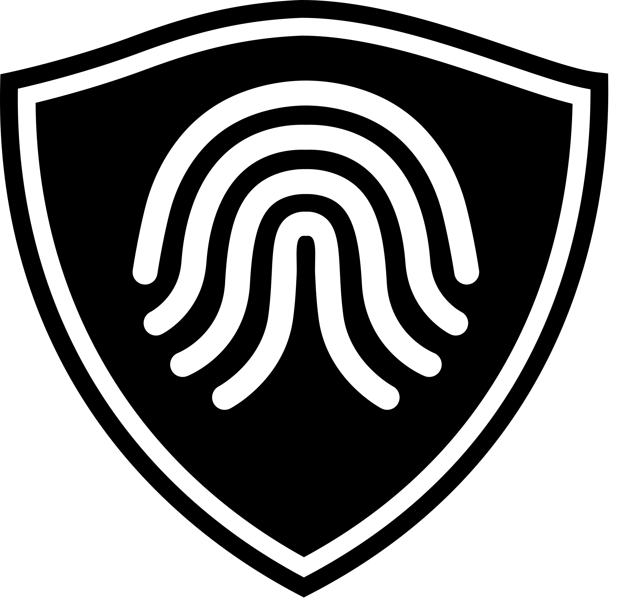
Shield anatomy & meaning
The Shield
A rounded shield form with a subtle inner double-line border. The shield represents protection, trust, and reliability — the foundational promise of everything LogicalNet does. The form is modern and approachable, not aggressive or militaristic.
The Fingerprint
Three concentric arc lines forming a simplified fingerprint pattern centered within the shield. The fingerprint represents identity verification, uniqueness, and the human element of security. It subtly references biometric authentication.
The Gradient
The shield fills with a diagonal gradient from green (#22c55e) to teal (#0ea5c9). This gradient direction mirrors the upward-right trajectory of growth and forward momentum.
Color meaning
Green
Growth, trust, reliability, local roots.
Teal
Technology, intelligence, clarity, forward-thinking.
White Fingerprint
Transparency, verification, the human touch.
Clear space & minimum sizes
Clear Space Rule
Maintain clear space equal to the height of the “L” on all sides of the logo to avoid crowding. No text, imagery, or graphic elements should enter this safe zone.
Minimum Sizes
Full lockup: 120px wide minimum (digital) / 1.5 in (print)
Shield mark only: 24px minimum (digital) / 0.3 in (print)
Logo do’s and don’ts
Always Do
- Use the approved logo files (SVG preferred, PNG for raster contexts)
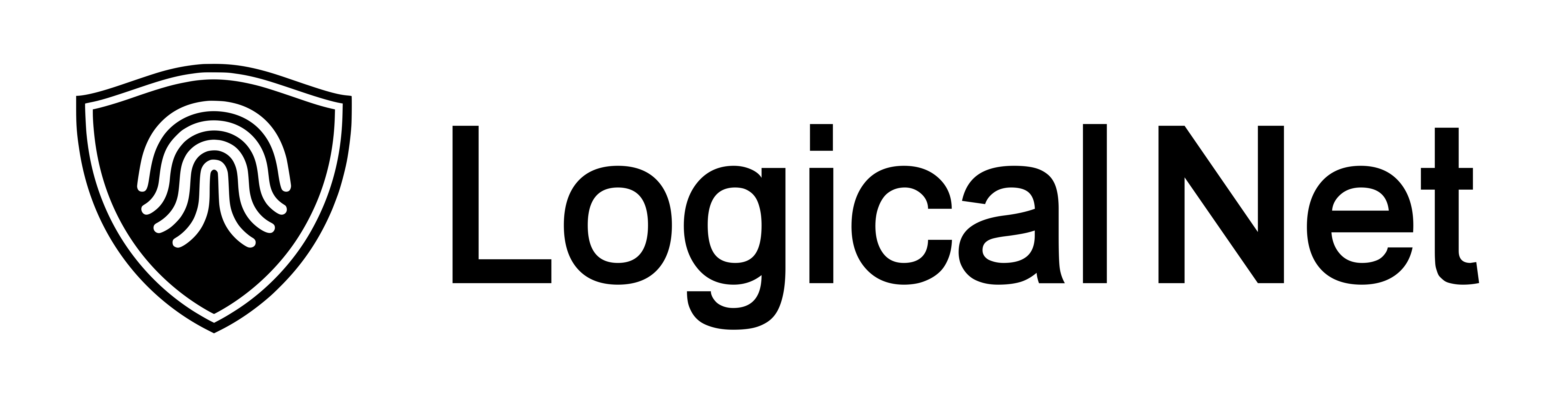
- Maintain the correct color relationships (teal wordmark + navy “Net”)
- Use on approved backgrounds: white, off-white (#f0f4f8), navy (#1a2e4a), navy-deep (#0f1e30)
- Preserve the shield gradient direction (green lower-left to teal upper-right)
- Maintain minimum clear space on all sides
Never Do
- Stretch, skew, or distort the logo proportions
- Change the wordmark colors or apply the gradient to the wordmark
- Place the logo on busy photographic backgrounds without solid color backing
- Recreate the logo in different typefaces
- Add drop shadows, outlines, or effects to the logo
- Use the logo below minimum sizes
- Reverse the gradient direction or use the shield mark in any other color
Logo source files
All official LogicalNet brand assets in three formats: SVG (vector, preferred for digital), PNG (raster with transparency), and JPG (raster, solid background). Each variant is designed for a specific context — use the right file for your background and placement.
Primary lockups
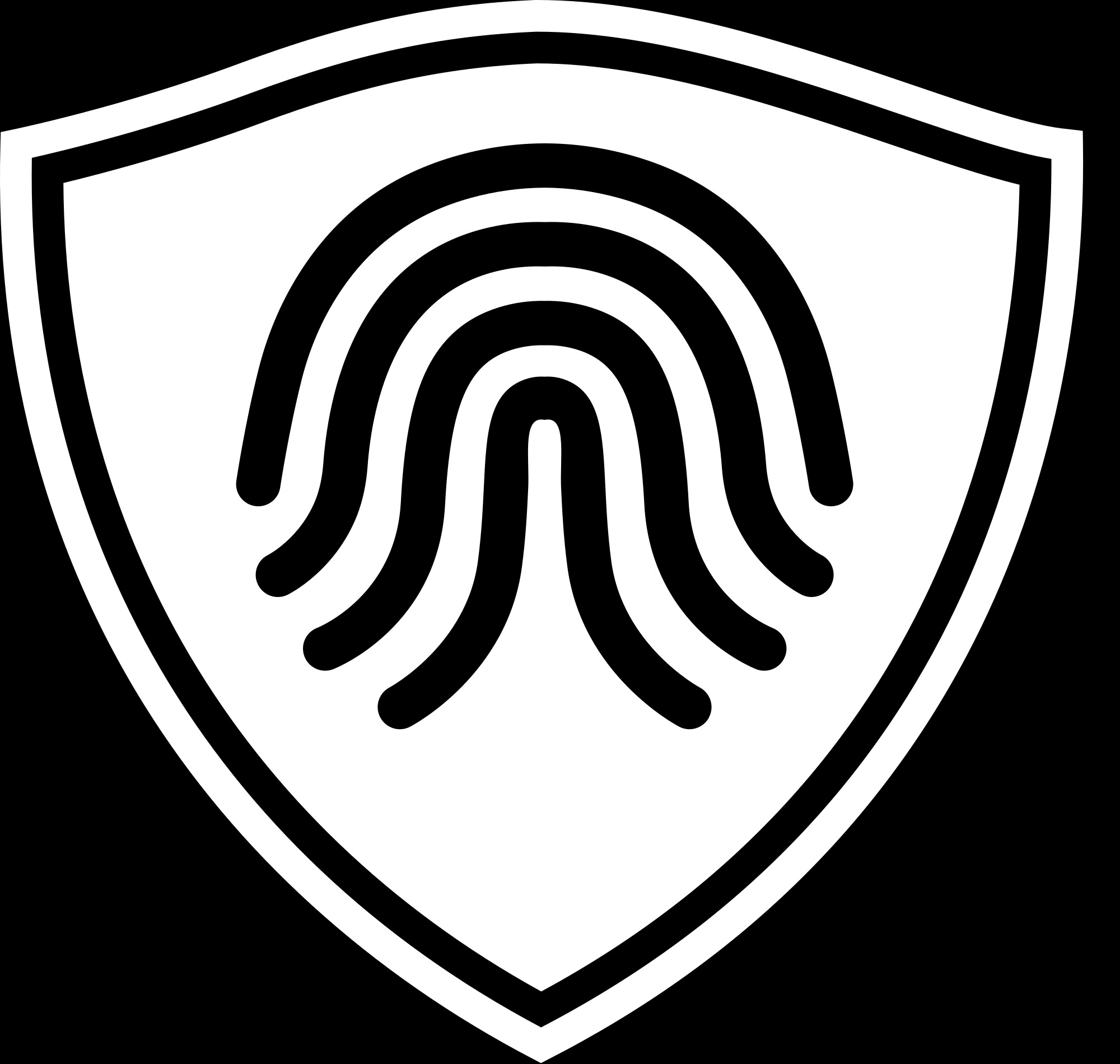
Shield mark only


Monochrome white shield with transparent inner gaps so the parent background shows through. Use on navy, dark, or photographic backgrounds where the colored shield would lose contrast. JPG preview composited on black for visibility.

Wordmark only


Which format should I use?
SVG is the preferred format for digital use — it scales perfectly, has the smallest file size, and supports transparency. Use for websites, apps, email signatures, and any digital context.
PNG is a raster format that supports transparency. Use when SVG is not supported (some older tools, social media uploads, Slack emoji).
JPG is a raster format with a solid background (no transparency). Use for contexts that require a background-baked image, such as some legacy print workflows or third-party submission forms. For anything else, prefer SVG or PNG.
Questions about brand usage?
Contact the marketing team for brand approvals, source files, or guidance applying the brand in specific situations.